Create website for new iPad's retina display
24 March 2012
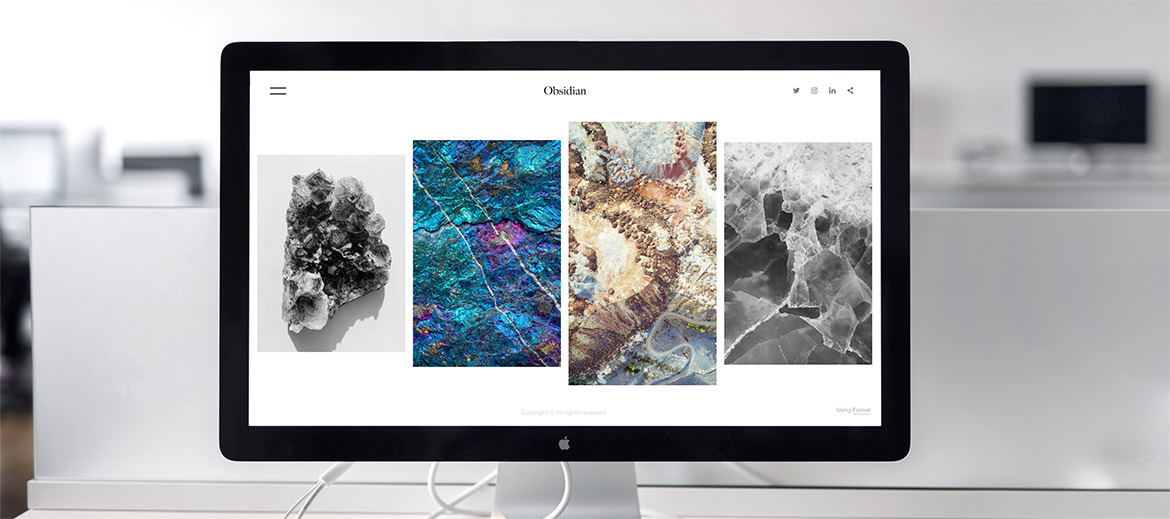
Images on most websites looks blur on iphone 4s and the new iPad. This is beacuse the high DPI of retina screen requires a much higher resolution image to be displayed.
The basic idea is to determine which display is the device using, and to load a set of higher resolution of pictures if the device is using retina display.
<link rel="stylesheet" type="text/css" href="css/normal.css" />
<link rel="stylesheet" type="text/css" href="css/retina.css" media="only screen and (-webkit-min-device-pixel-ratio: 2)"/>
At normal.css , for the same class/id of background image, specify a lower resolution image.
#sample {background-image: url(../images/lowres.png);}
At retina.css, for the same class/id of background image, specify a higher resolution image. It will override the css in the normal.css.
#sample {background-image: url(../images/hgihres.png);}
