4 Timeless Design Principles To Boost Your Website’s Conversions
04 September 2018
When it comes to website design, most business owners tend to focus more on aesthetics and beauty in our own perspective, but tend to forget our websites should be primarily designed for conversions sales and ultimately our visitors.
The true measure of an effective website is the business results that it can drive.
Whether you are selling a novel product or an awesome service, what you want are results - your visitor taking action to convert or buy. These could be leaving their emails in your subscription form, placing a pre-order or leaving a business enquiry for your services.
You want to convert their attention into tangible results - sales & enquiries.
If copywriters and content marketers use their own set of principles to boost conversions including scarcity, social proofs, and free trials, shouldn’t there also be a similar set of design principles we can apply to our websites to increase our conversions?
That's why we have compiled 5 conversion design principles you can implement on your website to boost conversion rates!
1. Use White Space For Clarity
If you have to choose between a fantastical design that is cluttered and complex versus a simpler version that is clear, always choose clarity.
One of the biggest mistake many websites have is jamming their information so closely together that their visitors have a hard time locating the important call to actions, links and even the play-button for videos!
By using ample white space, you will create much-needed clarity for your visitor, allowing them to quickly locate and take action.
Word of caution though, don’t overuse white space - a big chunk of empty white sections can create a sense of disconnect for readers leaving them wondering if your content has ended.
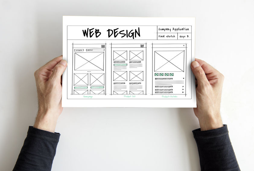
2. Establish Proper Visual Hierarchy
When people scan through a website, their eye movements tend to follow an F-shaped and Z-shape patterns, from left to right and up to down. Knowing this information is important and will allow you to arrange your images and content to establish a clear visual hierarchy.
A proven way to establish proper visual hierarchy is to place your headlines and content on the left with your supporting image towards the right following a strong supporting paragraph before a call-to-action on the third line.
While it is not necessary to always align your information to the left, having them centered is also a viable option as long as your visitor follows the correct flow of information that you desire.
3. Utilize Color Theory To Your Advantage
Color is one of the most underrated but powerful tool a designer has.
Color invokes emotions, it tells a story and sets the mood for your visitor and is a prime visual cue that you can easily test to optimize your conversions, switching from one shade to the next to discover what might work best.
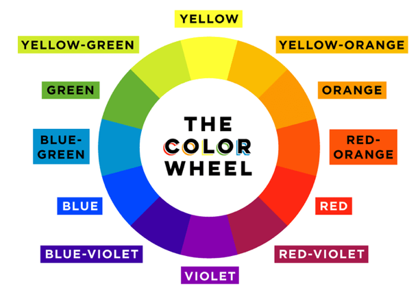
The Emotion Of Different Colors
Different colors bring with them different emotions when applied to a different context.
While the color blue might inspire trust and often is used by banks financial institutions as their primary color on their website, it is a rather poor call to action color that just doesn’t grab attention.
The color yellow while too gaudy to be used as a background color, it serves as a fantastic attention-grabbing call to action color that is often used in e-commerce and travel websites to get visitors to convert and transact.
The infographic below captures nicely the different emotions related to each different color you might be considering associating your brand with.
https://vwo-com.s3.amazonaws.com/uploads/sites/3/2013/07/color-theory_kissmetrics.png
Creating An Effective Color Combination

When it comes to adding stability and attention-grabbing elements to your colors, the triadic color scheme offers the most balanced and is composed of 3 colors on separate ends of the color scheme.
This contrast helps you to quickly identify the right call-to-action color that matches the base color of your website.
Having a website that is coded primarily in blue? Yellow might be the perfect choice as your call to action button.
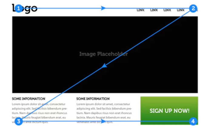
4. Enhance Your Call To Actions With Directional Cues
Sometimes you will have to guide your visitors directly to your call-to-action especially if there are many elements on your website.
From video testimonials to a product feature packed with a benefits packed copy, utilizing
directional cues to lead your visitor is a smart move that is shockingly still under-utilized.
Encapsulation Cues
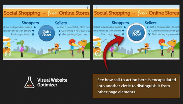
A popular way to direct attention is to encapsulate or frame your call to action area by segmenting them into a visually distinct area on your webpage.
These can not only just include the call to action button, but also contain the offer headline as well as the supporting content that helps convince your reader to take action.
Encapsulation cues are phenomenal at almost every part of your website can be used in its static form or a pop-up as your visitor moves to close their browser’s window.
Arrow Cues
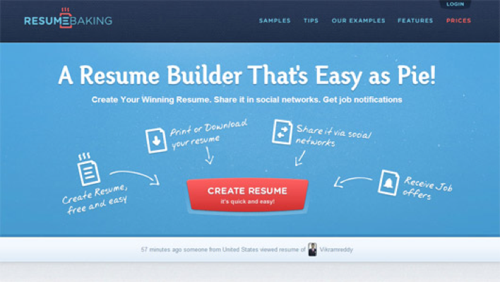
One of the most time-tested and proven methods to direct attention is the good old arrow pointing to your call-to-action section.
From pointing the direction to the button itself to a supporting testimonial beside the call to action, arrow cues are perfect tools to let you surgically direct attention to the exact parts of the webpage you desire.
Eye-Direction Cues
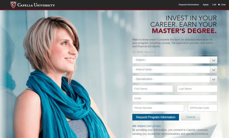
When some is staring intently off into the distance, chances are we look towards the same direction to figure out what is grabbing their attention - the same applies to your website images as well!
By using this same principle, you take advantage of an inbuilt evolutionary trait that all humanbeings have. Structuring your page with images of people staring at your call-to-action button is a great way to implement this directional cue.
Conclusion
From using the correct color combination to generous application of white space, the 4 principles we shared are grounded deep in human psychology and can be effectively applied to every situation and most industries.
When it comes to design, it is all about ensuring your visitor has an easy and comfortable journey to where you want them to go. So go ahead and use these principles to convert their attention into tangible returns for your business!


