6 Hot Design Trends For Your New Website To Adopt
23 November 2018
It’s 2018 and when it comes to website design, marketers and business owners alike are seeking to constantly delight our customers and showcase our brand as relevant, trendy and possibly even cool!
While standing out from your competitors and the industry might be your highest priority, it is just as important to note that user experience still holds true to ensure that the overall design is fun is seamless in both the creative angle and business function.
Let’s take a quick journey and discover the 6 design trends are red hot and ideal for your business website in 2018, 2019 and beyond!
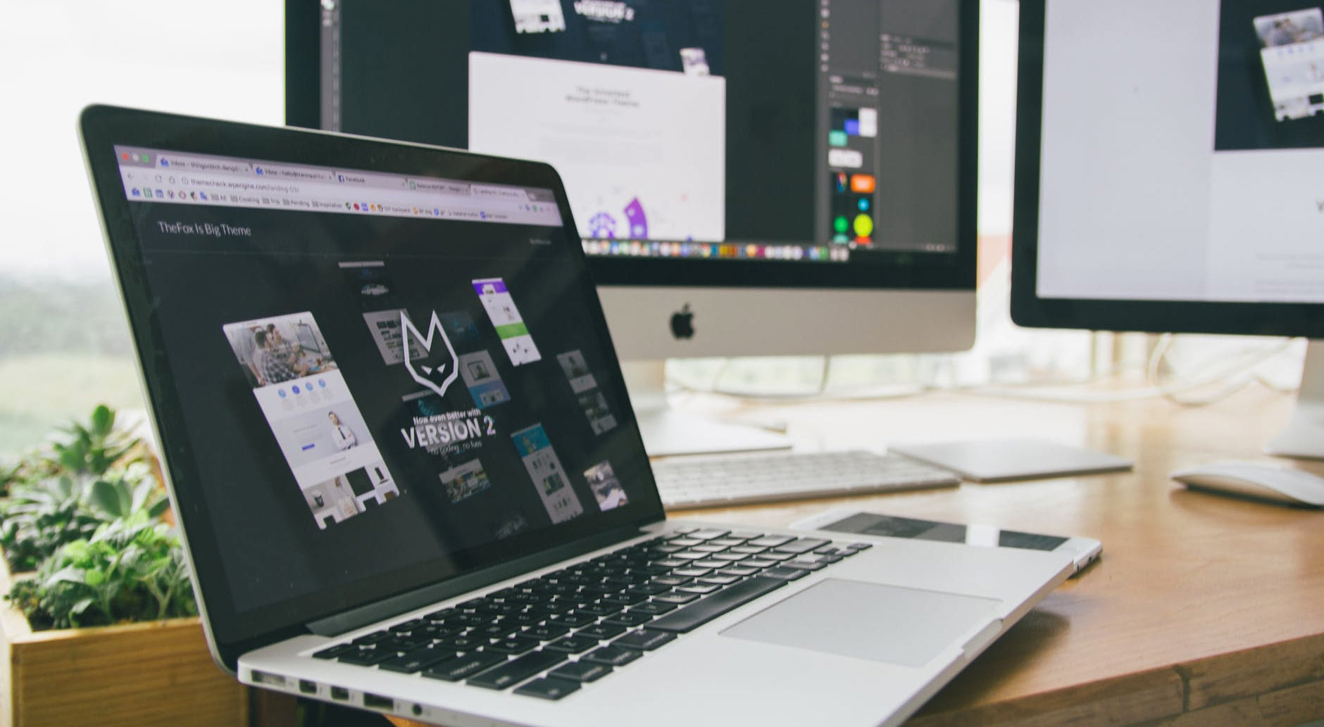
1. Hand Made & Custom Illustrations
Gone are the days of featuring just pictures of products, websites today are beginning to adopt handmade and customer illustrations for businesses selling both services and products.
Custom illustrations help solve one big challenge that no amount of live shots or photography can: bringing abstract concepts to life that real photography can’t.
If you are a software business selling accounting platforms to various businesses big and small, illustrations on your website will allow you to speak to a diverse group of customers to maintain a rather flexible marketing message.
While live shots of real people can definitely work wonders (especially if your business revolves around a specific group of people), consider adopting custom illustrations if your product is targeted towards a diverse group of prospects while making businesses perceived as serious be more approachable to their customers.
2. Vibrant Hues & Colors
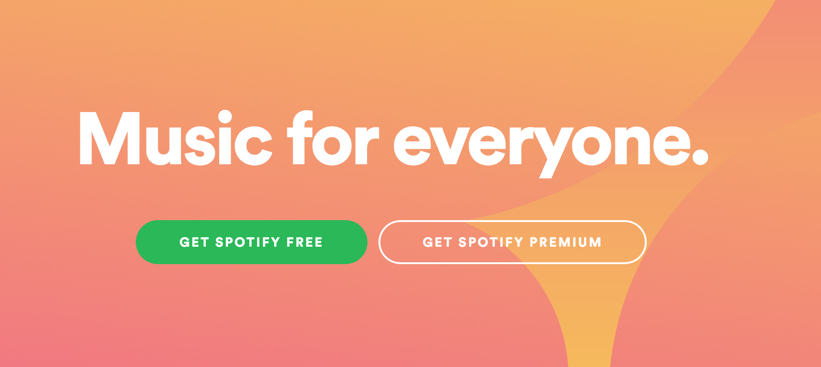
The common adage for many years has been ‘stick to your brand colors’, keep it ‘simple and consistent’ but as we move into 2018 and beyond, many web designers are becoming more courageous in their color selection.
From supersaturation to vibrant hero sections, websites like Spotify, are adding bursts of rich colors to convey emotion and capture their visitor’s attention.
Want to position your brand as edgy, out of the norm, rebel and stand out from the rest of your competition? Consider using vibrant hues and color
3. Dynamic Gradients
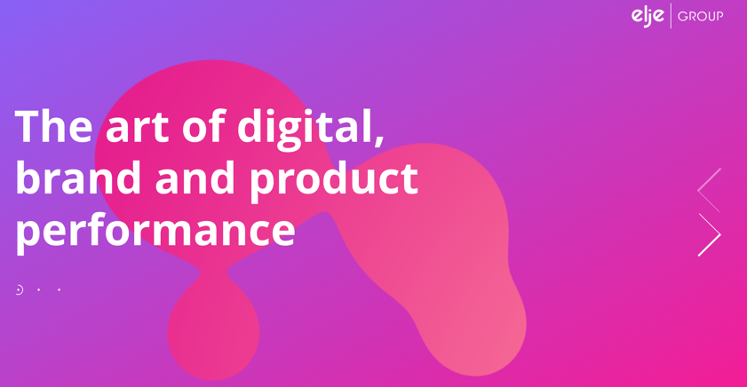
Remember websites that just focused on one or two main solid colors? We can’t either!
The transition from monotone colors to vibrant gradients are getting bolder and brighter and their uses are plentiful, from encompassing the entire website to the hero banner, dynamic gradients allow for a seamless transition from one color to another while yet maintaining a visual contrast treat for the eyes
I) Use It For Your Header Backgrounds / Hero Section
One of the most popular and tested ways to use gradients would be your header section. Incorporating a two or three tone gradient will help to capture that much needed attention of your visitor to continue reading your message.
II) Scrolling Gradients
From creative services to products promising new experiences, consider using dynamic gradients that change as your visitor scrolls through the site to enhance their visual experience, instantly making your brand memorable.
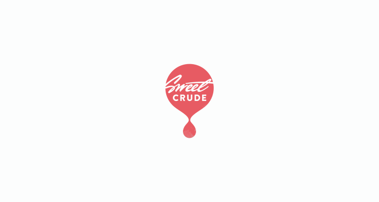
III) Logos With Gradients
Still sticking with flat and monotone colors? Not to worry, there is still a solution!
By creatively using gradients on your logo itself, you can utilise the flat colored background as a good contrast point to stand-out even further as well as open the door for your brand to celebrate seasonal events and global causes easily (without having to redesign your whole website!).
Done right, a gradient logo on a flat background could be just as impressive as a full-layered gradient background.
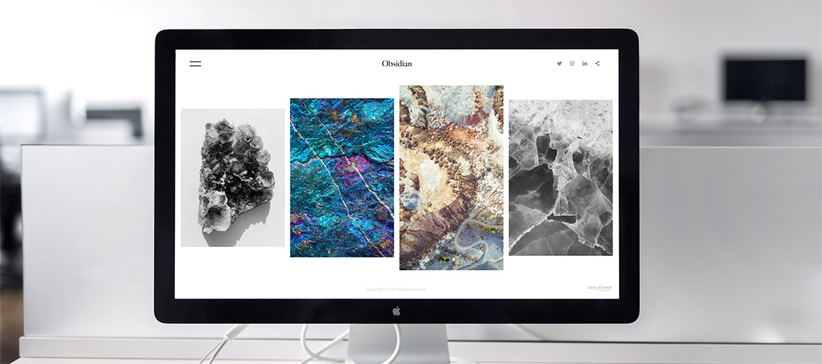
4. White Space
When it comes to user experience, perhaps nothing is more annoying for your visitors to encounter a whole bunch of text, pictures, graphics all clumped together making hard for them to choose to focus on the content or the visuals.
The solution? Proper use of white space. White space is important to incorporate in almost every website to help the important elements of your website - product descriptions, instructional visuals and product pictures to stand out from everything else. Looking to maintain a sense of elegance and balance? Incorporate white space.
Is your website focused on e-commerce? White space will help increase those conversion rates you so dearly desire. From features and benefits to call-to-action buttons, white space will help your visitors focus on taking that next step and you will be that much closer to the next sale.
5. Website Animations
From impressive page motions, loading animations to background animated loops, websites today are becoming pure eye candy for visitors.
While this can definitely take your user-experience up a notch, it is important to note that it shouldn’t be so distracting that your visitor stares at it constantly without browsing through the rest of your site! It should complement your web design and not be the sole focus!
Using website animations, while a little more advanced, will help you brand create impressive experiences for your visitor that will result in a higher perceived value of your brand and company - if done right!
6. Animated & Dynamic Logos
What do you visualise when I say the word ‘logo’? Probably a static image that represents your brand, or maybe a word or a static image.
While logos made up of static words and pictures will probably be here to stay, animated and dynamic logos are beginning to shake things up and add new layers of story-telling and depth into just the logo itself.
From just a simple color change, a logo can be portrayed to convey certain emotions and evoking the personality of your brand that a static logo never could.